
113
Subscribers count
67.96K
Views count
80
Uploads
ES
Country
Subscriber & View Count History for Data Man
Weekly gained views for the last 12 weeks
Weekly gained subscribers for the last 12 weeks
Statistics summary for Data Man
| Date | Views Gained | Total Views | Est. Earnings | Subs Gained | Total Subscribers | New Uploads | Total Uploads |
|---|---|---|---|---|---|---|---|
| 2026-06-18 Thu | +50 | 66.41K | 112 | 80 | |||
| 2026-06-19 Fri | +86 | 66.5K | 112 | 80 | |||
| 2026-06-20 Sat | +54 | 66.55K | 112 | 80 | |||
| 2026-06-21 Sun | +65 | 66.62K | 112 | 80 | |||
| 2026-06-22 Mon | +49 | 66.67K | 112 | 80 | |||
| 2026-06-23 Tue | 66.67K | 112 | 80 | ||||
| 2026-06-24 Wed | +141 | 66.81K | 112 | 80 | |||
| 2026-06-25 Thu | +49 | 66.86K | 112 | 80 | |||
| 2026-06-26 Fri | +59 | 66.91K | 112 | 80 | |||
| 2026-06-27 Sat | +65 | 66.98K | 112 | 80 | |||
| 2026-06-28 Sun | +53 | 67.03K | 112 | 80 | |||
| 2026-06-29 Mon | +47 | 67.08K | 112 | 80 | |||
| 2026-06-30 Tue | +44 | 67.12K | 112 | 80 | |||
| 2026-07-01 Wed | +16 | 67.14K | 112 | 80 | |||
| 2026-07-02 Thu | +76 | 67.22K | 112 | 80 | |||
| 2026-07-03 Fri | +72 | 67.29K | 112 | 80 | |||
| 2026-07-04 Sat | +61 | 67.35K | 112 | 80 | |||
| 2026-07-05 Sun | +58 | 67.41K | 112 | 80 | |||
| 2026-07-06 Mon | +37 | 67.44K | 112 | 80 | |||
| 2026-07-07 Tue | +72 | 67.52K | 112 | 80 | |||
| 2026-07-08 Wed | +68 | 67.58K | 112 | 80 | |||
| 2026-07-09 Thu | +47 | 67.63K | 112 | 80 | |||
| 2026-07-10 Fri | +46 | 67.68K | 112 | 80 | |||
| 2026-07-11 Sat | +82 | 67.76K | 112 | 80 | |||
| 2026-07-12 Sun | +55 | 67.81K | 112 | 80 | |||
| 2026-07-13 Mon | +9 | 67.82K | 112 | 80 | |||
| 2026-07-14 Tue | +27 | 67.85K | +1 | 113 | 80 | ||
| 2026-07-15 Wed | +46 | 67.9K | 113 | 80 | |||
| 2026-07-16 Thu | +39 | 67.93K | 113 | 80 | |||
| 2026-07-17 Fri | LIVE +21 | 67.96K | 113 | 80 | |||
| Daily averages | +51 | ||||||
| Last 30 weeks total | +1.59K | +1 |
Last updated 2026-07-17
Latest videos

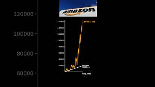


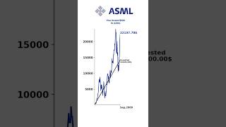
What If You Invest $100 in ASML? 💰📈
1.59K views
What Happens If You Invest $100? 😊
475 views
Similar channels to Data Man
| # | Channel | Subscribers | Views | Uploads | |
|---|---|---|---|---|---|
| 1 |
|
Your Daily Tubes | 6.08K | 1.49M | 1.4K |
| 2 |
|
Rachit Hirani | 10.3K | 136.08K | 6 |
| 3 |
|
TOYOTA MOTOR MANUFACTURING INDONESIA | 11.8K | 3.49M | 432 |
| 4 |
|
Real Response | 8.07K | 1.51M | 157 |
| 5 |
|
A Singha | 7.65K | 139 | 5 |
| 6 |
|
Veedol | 8.56K | 100.3M | 300 |
| 7 |
|
100 English Quiz | 5.76K | 7.16K | 9 |
| 8 |
|
NURSEMA HOCA İLE MATEMATİK (PiMAT1) | 14.1K | 7.42M | 2.3K |
About Data Man
Data visualization is a powerful for any data analyst looking to make sense of financial information and spot trends easily. 📊 By turning complex numbers into clear graphs and charts, it helps in understanding data at a glance and making informed decisions. 💡 Whether using time series graphs to track changes over time or pie charts to compare different categories, effective visualization allows data analysts to uncover insights quickly and communicate findings effectively. 🌟
ab27b3514bfd852d1569